Role
Product Designer
Skills
Product Design
Timeline
Q3 2024

Overview
Vira Health is a femtech offering menopause care in a world with limited access to it. Stella+, a digital health assessment, provides menopause insights, medication, and clinician appointments.
The health assessment identifies an individual’s menopause symptoms and risks , generating a personalised treatment options which can include medication, clinician appointments and access to the Stella lifestyle app
20,000 assessment completions within the first year
Piloted in 5 NHS trusts and 3 large employers
Available in the UK, the US and South Africa
The challenge
I worked on improving both the UK and US check-out flow to explore areas to of friction and improve conversion from onboarding to choosing care with Stella.
Below is a Whitelabel version of the UK assessment to illustrate the user journey.
Research & Discovery
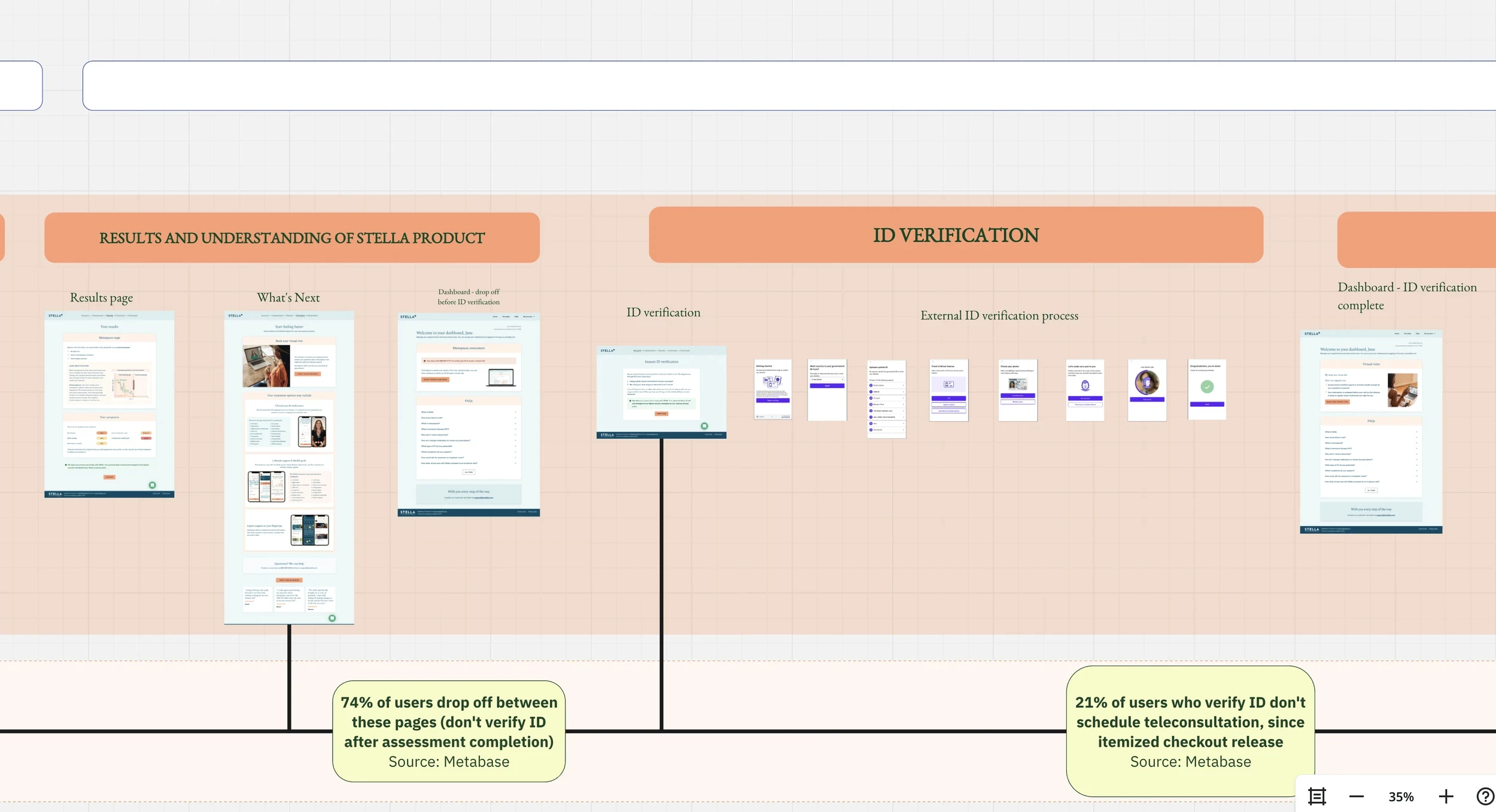
The customer journey map
I created a journey map to visualise the entire user experience in collaboration with the UX Researcher, helping to identify key points of drop-off. Working closely with the clinical and marketing teams, we looked at enhancing the overall user experience.
User research
Alongside the user research team, we spoke to to 20+ menopausal women regarding their health motivations and concerns to ensure we were not designing based off assumption.
There is a need for comprehensive menopause care in the US, many women have annual reviews but not regular care throughout the year to manage symptoms
Expertise in subject matter and follow-up care were important in when paying for a potential menopause provider
Up to 80% of women say they would prefer personalised menopause care but find access difficult or confusing.
Results Page
What's working | What's not working |
|---|---|
Testers valued visualising their menopause stage and the reasons for this from the assessment. | The rest of the information was overwhelming and confusing |
The Stella app is mentioned with its coach app component - testers assumed this meant they could ask medical questions without the need for a doctor. |
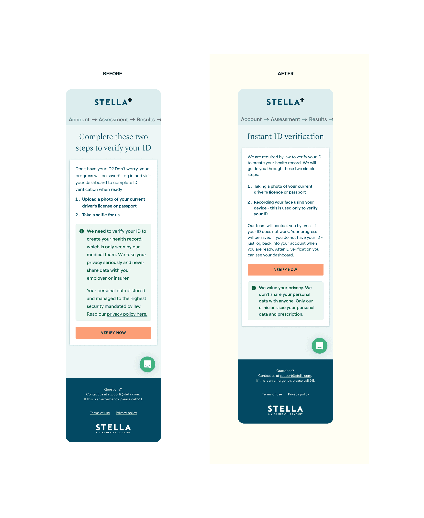
ID Verification Page
What's not working |
|---|
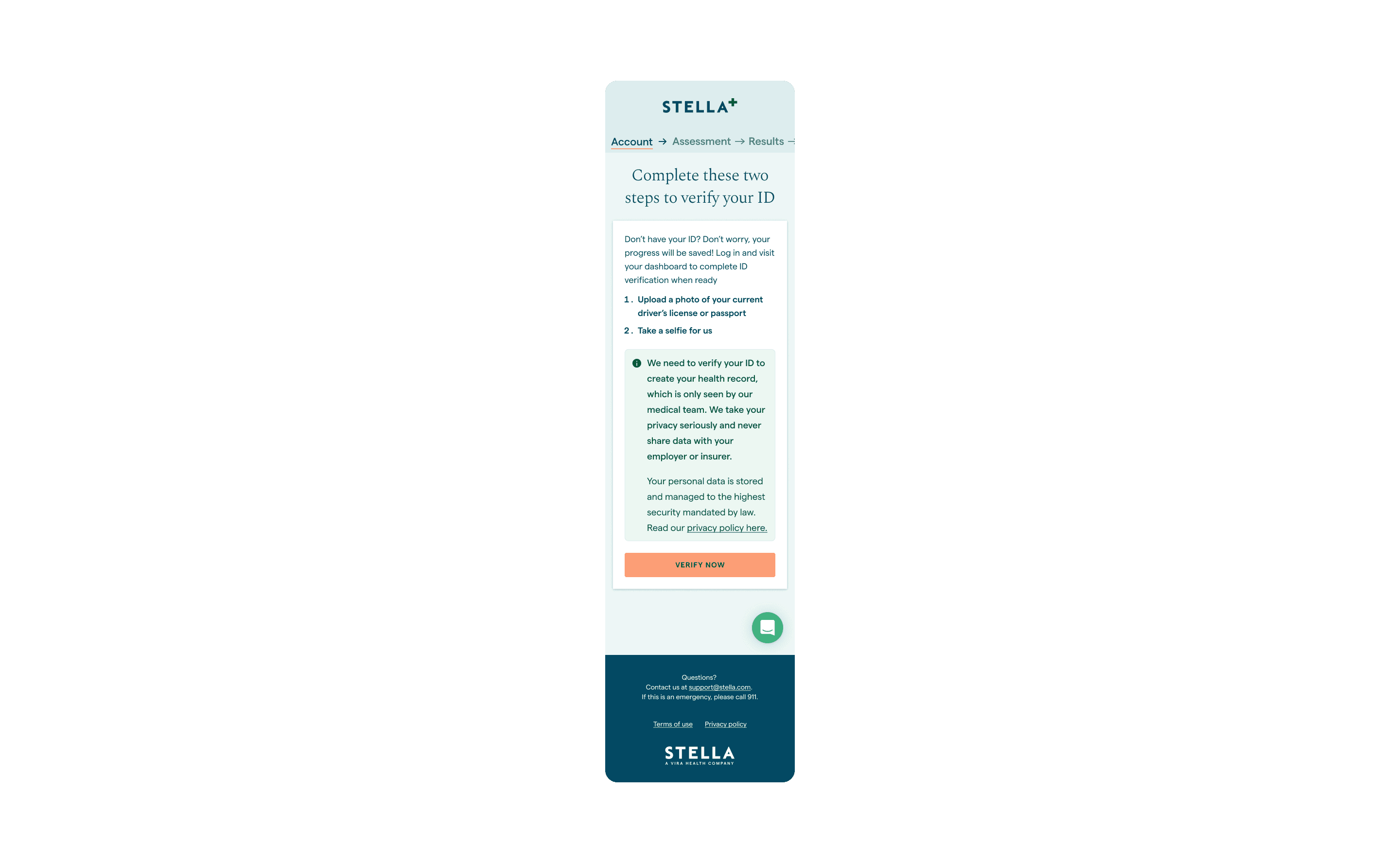
Only 12% of users were completing this step at the account stage before even starting the assessment. "I don't understand what they're going to do with it" said one tester. |
"Take a selfie" language felt too casual |
Another screen with a lot of information to take in |
Ideation
Results Page
Finding an education moment
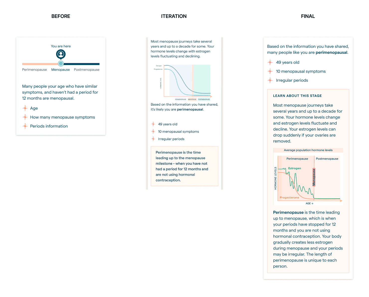
I found there was more opportunity to teach about the hormonal fluctuations of menopause, I designed the graph and worked alongside the clinical and content team to explain each stage with the best copy.
Simplifying the page
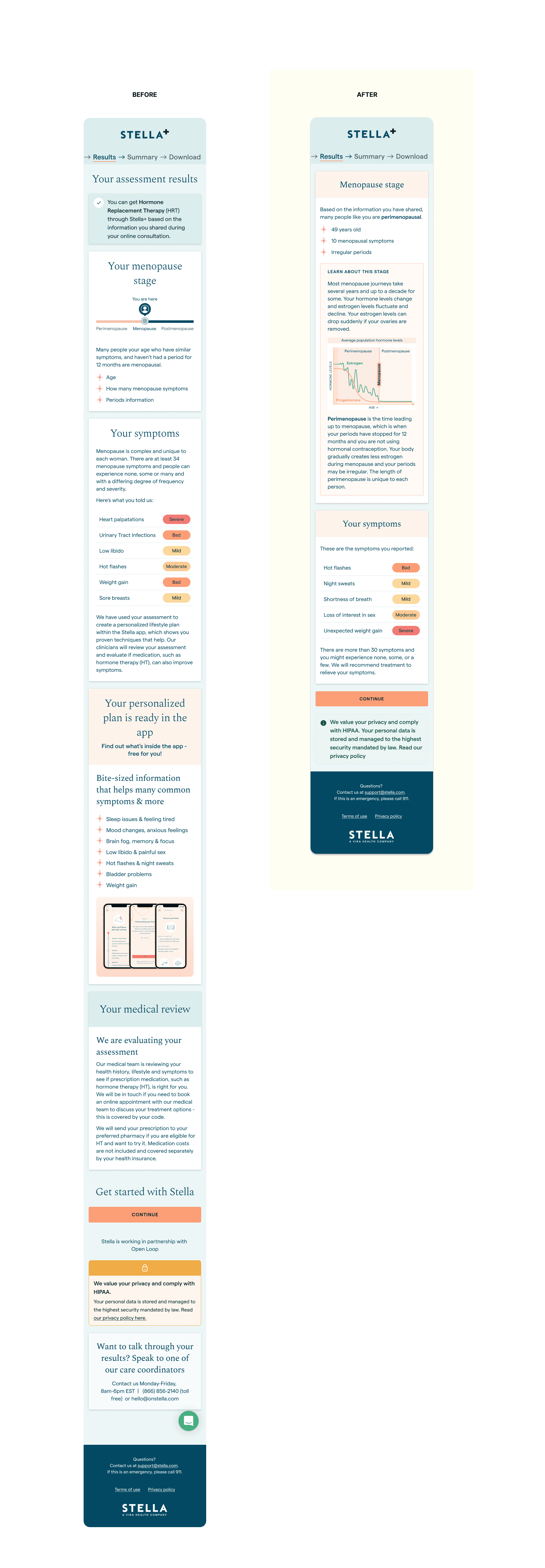
Focusing the results page on the menopause stage and the symptoms from the assessment only would reduce cognitive load and provide a clear picture of a menopause woman going through the flow.
Constraint: In the US, the assessment was not a registered medical device and thus copy had to be less of a diagnosis but more of a likely diagnosis
ID Verification
I worked alongside the user research and content teams to improve the copy and conciseness of this page.
Final Solution
Learnings
Overall we saw a 60% increase in conversation rate from onboarding to paying customer (US) with a 7% increase in ID verification completion (12% to 19%)
Embracing iteration within constraints
Designing for a complex health product with clinical and technical constraints taught me the value of rapid iteration and collaborative problem-solving. I had frequent touch points with the engineering team and worked closely with the CEO to align on priorities, present design options, and continuously refine solutions that balanced user needs with feasibility.
Testing Early with Real Users
Conducting usability testing with menopausal women before launch proved invaluable. It validated assumptions and ensured our design decisions were grounded in empathy and real-world behaviour.
Being Intentional with the Design System
I learned to use our existing design system efficiently, expanding it only when absolutely necessary. This helped maintain consistency across the product while still allowing room for flexibility when the product requirements called for it.

